
Choosing the best color palette for your wedding’s season.
Talking bridal details is one of my favorite things to do as a professional wedding photographer. Collaborating with couples during their planning always helps their creativity flow. More importantly though, it opens a conversation that helps guide clients in making decisions about their day that directly affects the outcome of their portraits.
Considering how color plays a role through out your day can help us create a beautiful color story through your entire wedding gallery. Especially when working with a true-to-life-color photographer like me; Carefully curating and editing for color is my superpower!
So in today's blog we'll explore some key details in choosing your wedding day color palette generally and seasonally. Plus how to incorporate it through your decor, attire and more, for the highest impact.
FIND YOUR VENUE.
It’s always a good idea to select your venue before you begin exploring color palettes. This can be especially true for your wedding party attire.
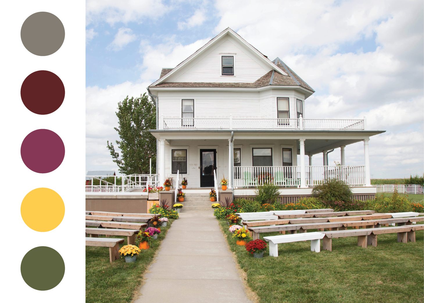
Is your top pick an upscale ballroom or a quiet cottage-style venue in the country? Use color to lean into the feeling of your venue and create a cohesive atmosphere. Deep saturated colors tend to appear more elegant and timeless, while brights feel playful and relaxed.
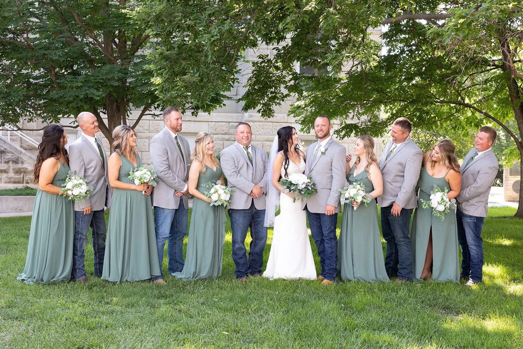
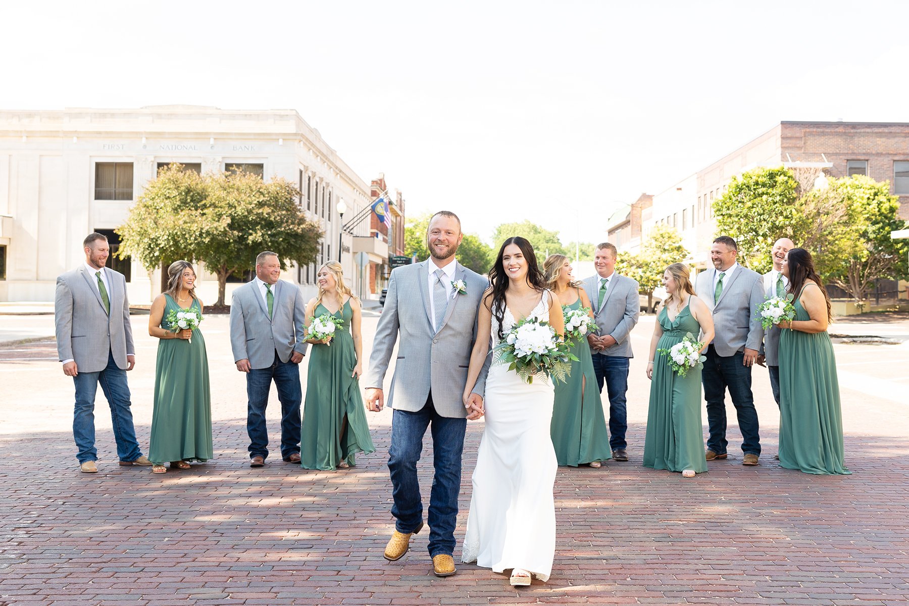
Does your ideal venue boast lots of beautiful outdoor scenery, or are you more inspired by architectural details of your favorite city? When planning your party’s attire consider if you want to coordinate with your surroundings or boldly contrast off your venue’s best photo ops. Below is a fantastic visual as to how your attire may look different based on your venue’s surroundings. This gorgeous wedding took place on a sweet summer day in June. So when shooting in green spaces the eucalyptus dresses blended softly into the foliage. Alternatively, when we stepped into the street the greens in their dresses and ties immediately popped against the brick road and neutral colored buildings.
Neutrals & Naturals
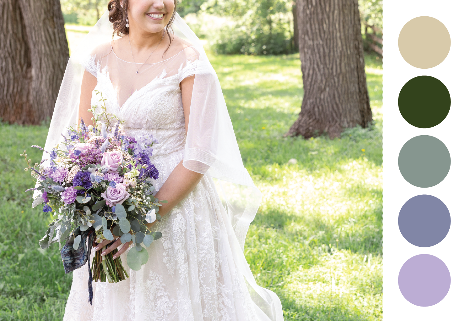
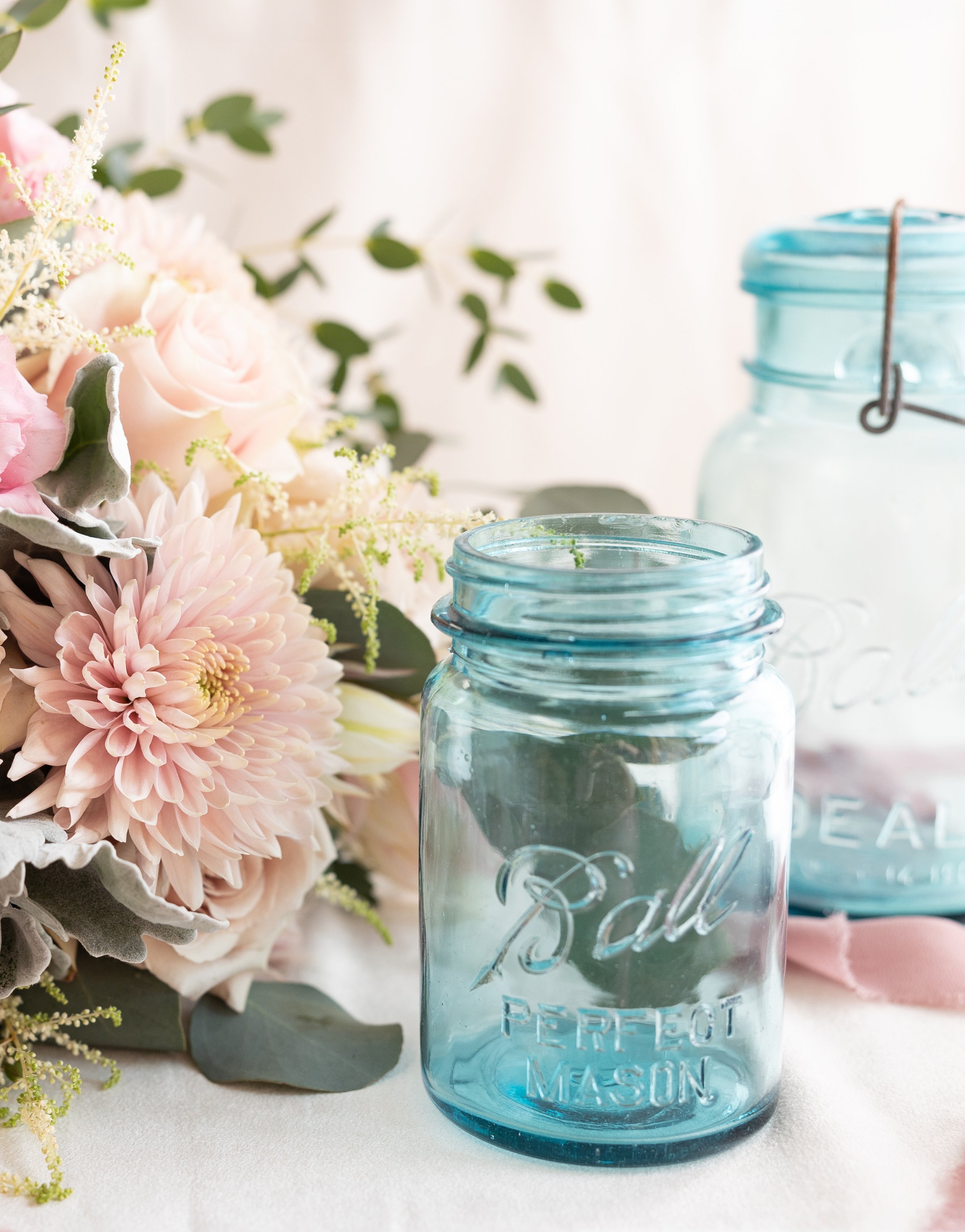
Every color palette will benefit from foundational neutral and natural elements. Neutrals and naturals are visually grounding and provide a needed “break” for the eye. They not only compliment the main colors in your palette, but help them to stand out and shine. So while you’re likely dreaming of bridesmaid dresses, napkins, florals and beyond in your favorite color — remember the unsung hero — your neutrals and naturals.
Neutral colors may include white, cream, tan, khaki, beige, greige, gray, charcoal, navy, brown, or black. Choosing the best neutral may depend on the season, location, or theme of your day. Fall weddings look fantastic with rich dark brown elements, while coastal events often feature beiges and navy. You may also want to play with color wheel compliments. Blue is across from orange on the color wheel, so a fall wedding might feature navy suits with deep rust colored dresses. Playing with warm vs cool can create a lovely balancing effect to your color palette.
Consider where wood, metal, stone or even glass materials can play their part within your venue, decor, or bridal details. Will your jewelry be gold, silver, rose gold, black, brass or copper? Maybe a mix of metals is your vibe! Do dark stained warm woods or light gray raw woods bring out your colors best?
Selecting the neutrals and natural materials that fit best with your scheme will make decision making easier if your main color isn’t available, or for when you need to include those visual breaks through out your wedding design.

SPRING & SUMMER PALETTES
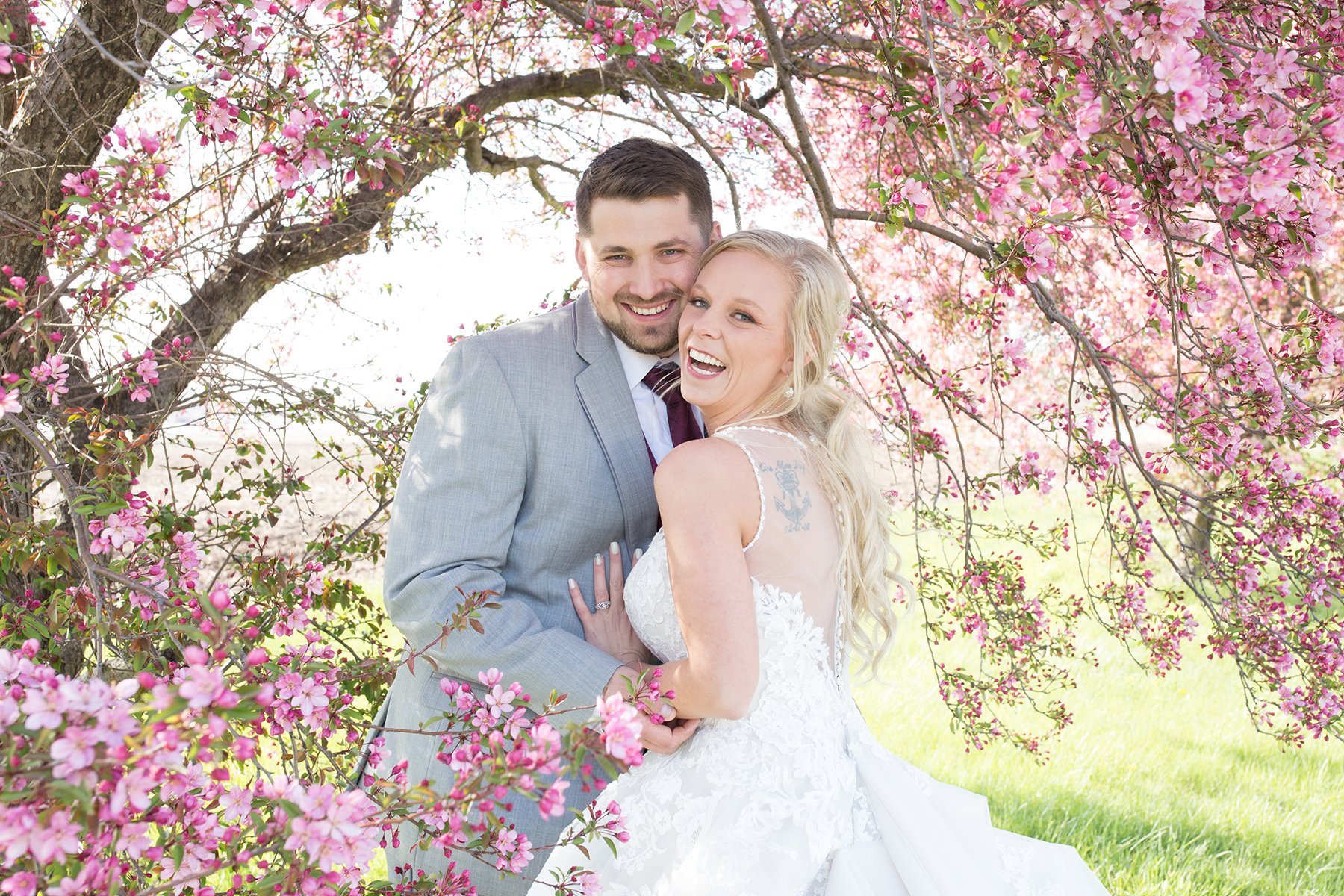
Spring and summer have a lot of cross over when it comes to selecting colors. At least more so than any other combination of seasons. While they do have a few key differences, both seasons are generally associated with bright colors, leafy foliage, and lush florals.
Often we associate Spring with slightly softer versions of colors, like pastels, because it’s how nature operates. (At least in locations that experience seasons.) Many of the florals and foliage are just starting to wake up and their colors aren’t in full force yet. Temperatures are typically still cooler. Weather can be a bit mixed with cloudy days making things feel more desaturated. Due to these environmental variations both pastels and rich jewel tones tend to work well in Spring. Some palettes even boldly mix the two together. Early spring weddings that echo winter’s scenery will most likely make rich jewel tones still feel more relevant. While late spring weddings make soft colors and pastel feel more on point.
Summer color palettes are known for their vibrant high-energy colors and lush green foliages. Colors that make you feel sun-kissed, ocean breezes, and joyful. Think sunset colors, cobalt blues, cheery yellows, and beyond. Bold colors look exceptional during this season, because in many places much of the landscape is green.
During green-washed summer months, couples who are leaning towards a shade of green as their main color, may want to consider how the hue of green they’ve selected will look against the green landscape.
FALL PALETTES
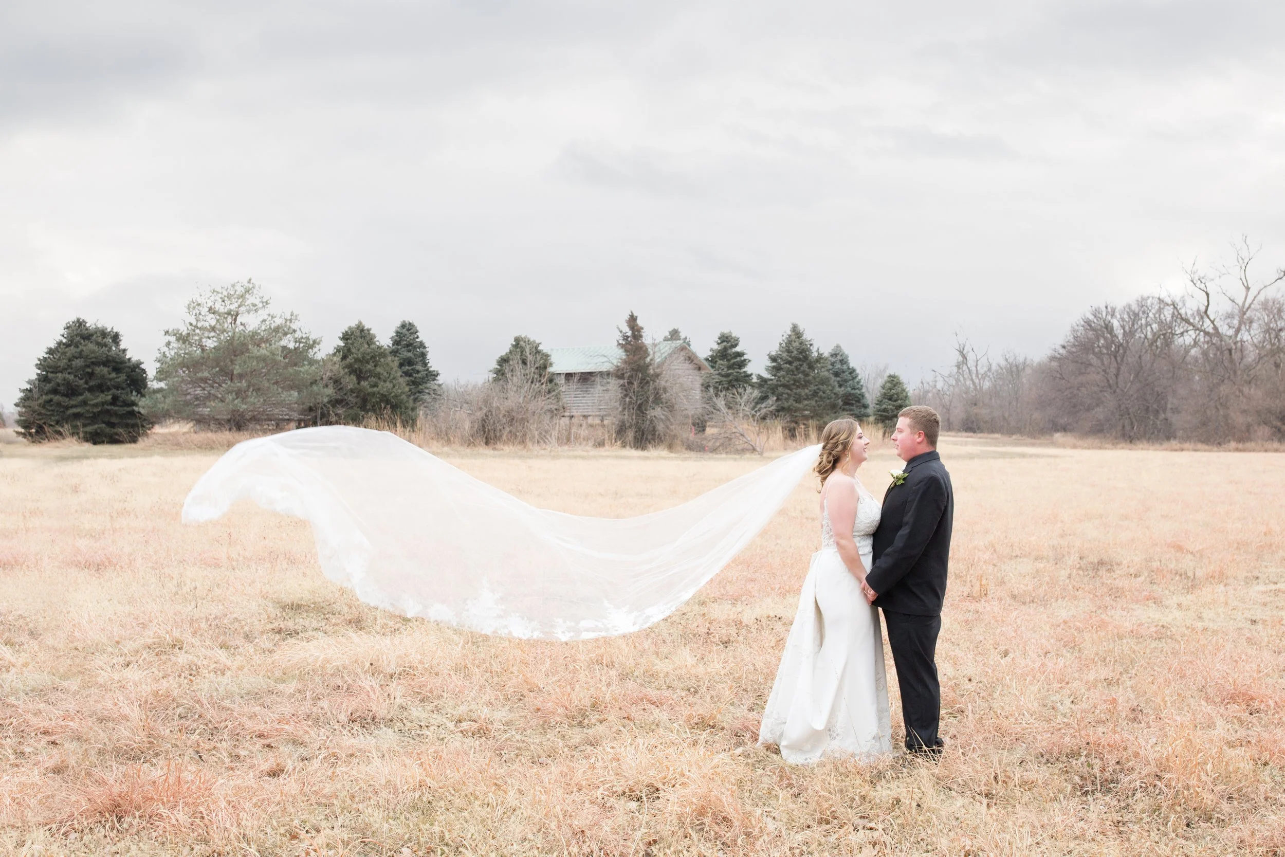
As the days get cooler and shorter we move to rich warm colors and earthy neutrals. An all time favorite for many couples across the states. Though fall can also be a challenging season in many states. The scenery during this time can vary quickly, and your window for fall foliage can be limited. For example, September is widely considered a "fall month," because the official first day of fall lands there. In reality the official day lands very late into September. In many states, including Nebraska, we often don't see big bursts of fall colors in nature until sometimes mid-October!
This can make it tricky when selecting early fall wedding palettes. If you've chosen September as a "fall wedding date" your wedding colors may still be competing with lush summer scenery. That said it's always a good idea to consider what your location and venue may look like during the specific part of the season you've chosen. Consider how your decor, attire, and portraits may be affected if the scenery hasn't evolved into the full blown fall wonderland you've designed around.
During those early fall days, I love to see fall-inspired saturated colors. Warm tones like burgundy, mulberry or rust. They scream fall, but still pop off green landscapes beautifully. These colors still look great during mid-fall, or once those tree color emerge, you may consider neutral attire like deep browns, tans, griege, or even navy or dark teal for a lovely bold contrast!
Late fall weddings sometimes miss the bright bold colors we associate with the season, but thanks to the soft neutrals during the fall to winter transition, it's easy to still fit fall details into the landscape.
WINTER PALETTES
Winter weddings are sometimes underrated. The cold and weather alone tends to make couples worry about things like portrait outcomes and travel. But hear me out…winter offers some of the best planning and palette perks, too!
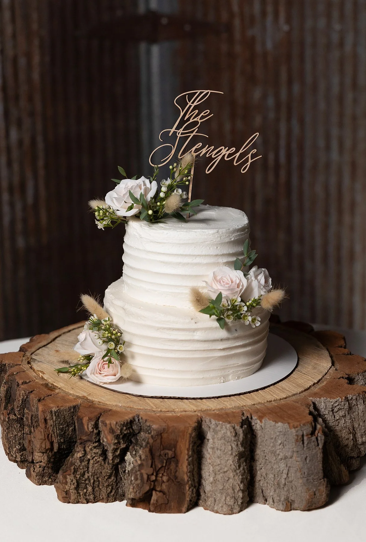
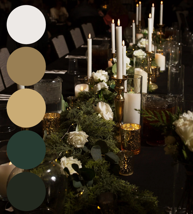
Two of my favorite design and color choices are perfect for winter weddings. The first is a “winter wonderland” style. Think crisp whites, warm golds, and icy or dusty blues. It’s the best way to embrace the chill! My other favorite is a classic greenery drenched theme with timeless creamy neutrals, like white and beige. While it’s a very simple color theme, it’s oh so dreamy!
On the other hand, winter is also an excellent time for rich jewel tones. Everything about the landscape is soft and neutral during this season. So a pop of deep rich color is chef’s kiss.
What season and color palette are you planning for your upcoming wedding??
Drop them in the comments!
Looking for your wedding day photographer? Let’s connect!